REMEMBER--some are Yaoi (hinted).
Quote:
HERE IS THE FIRST PICTURE DUMP: CLICKY
------------------------------------------------------------
Death Note:
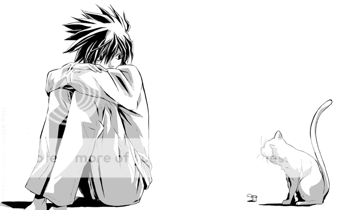
Simplicity proves to be the best. This is very cute. I like the lines. I am glad they chose to go with a very light shading. 5 stars ^.^
------------------------
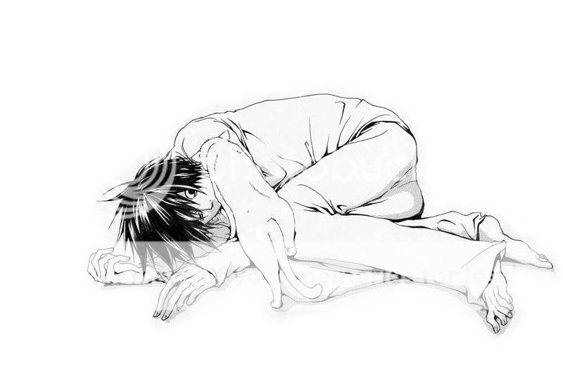
See the above comments. Add in 20x more "AWWWW"
------------------------
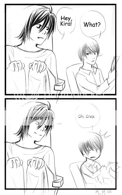
At first the style erked me, but it grew. It is very funny! They are so busy over thinking each other that it is believable that he would fall for a simple move like that. Well done.
--------------------------
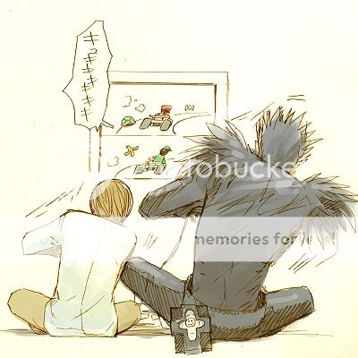
Funny, good game. THe coloring is minimal, but nice. Thats all I can say.
-----------------------------------
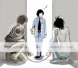
I can only say--BWHAHAHAHA!
------------------------------------
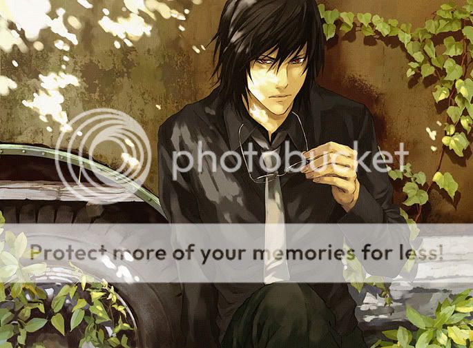
I am VERY impressed. I can see the texture of everything. That shows an eye to detail, time and a lot of effort. THe style is very similar, or dead on, to the original. You should be in the official art book, ma'dear.
--------------------------------------
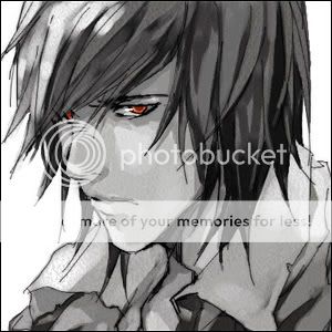
I am a big fan of grey-scale if it is done right. This one is. Borderline. The eyse could be a little more red. THey stand out, but not enough. They need a glint to be truly catchy. Also, the texture on his face matches that of his shirt. Get the boy some moisturizer.
---------------------------
BLEACH:
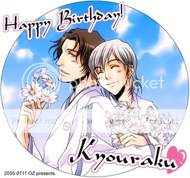
Cute, colorful, young, official o.0
--------------------------
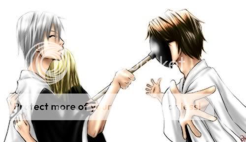
For all the effort that the hair had put into it, you think Kira would have his look better. Not so much dark, it looks oily. I feel like there is more then one light source. It must just be me. Let me look a little more, I'll get back to you....
----------------------------------------
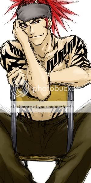
LOVE IT. The sketchy look fits his style and personality. The color is very nice and subdued. Very well done. Can I haz?
---------------------------------------
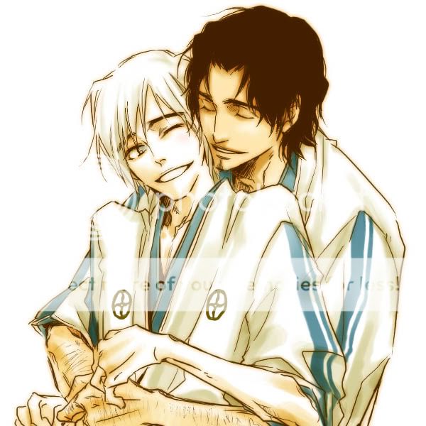
I'll make a leap and label this "VERY best friends" You know, the on the border, get your head checked you have nothing in common, friends. Also, no comments about them being an "item". The answer is no.
----------------------
Games:
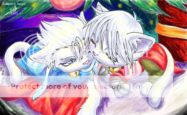
Marker? Well done. The colors are a little blurred. That is a GOOD thing. It makes you all warm and fuzzy to look at this. Of course, Dante and Vergy are going to send you to hell for it.
-------------------
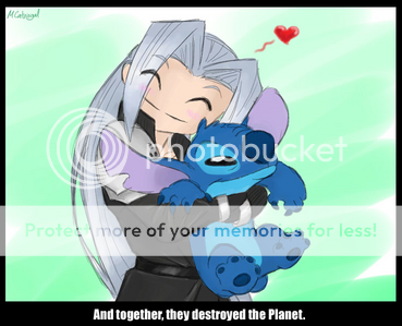
I think this one really just explains itself. Nice colors, though him as a chibi...I think his face is a little too squished.
--------------------
This icon explains SO much.
---------------------
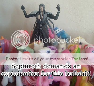
Explination: You took a wrong turn at the lifestream.
----------------------
Leon:
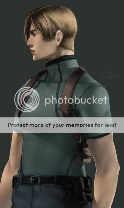
Nice choice for the pose. It looks 3-d and very very close to realistic art. It is perfect, change nothing. Ever.
----------------------
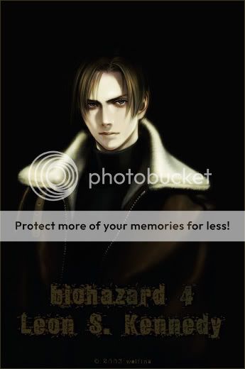
The good: His jacket looks fuzzy, his hair looks limp and greasy, like he has been in the field to long. It is dark and accurate.
The Bad: He looks drugged, hungover and sleepless.
-------------------
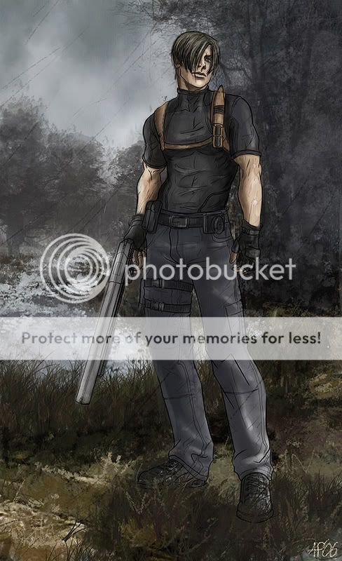
He could fit a gummy bear up that big nose o.0
This looks like something for a manga. I like it. The muted colors add to the atmosphere.
--------------
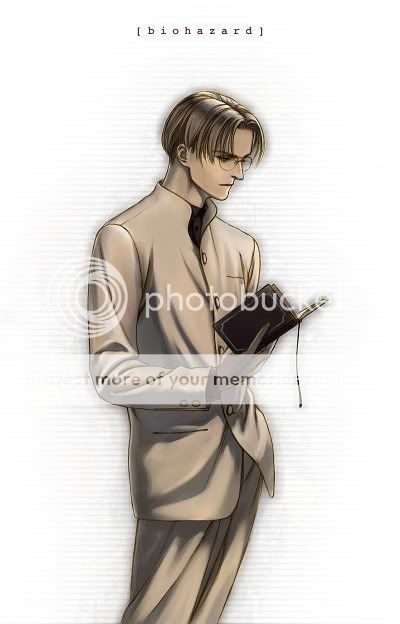
Are we SURE this is Leon? 'Cuz, this may be what he looks like if he quit while he was ahead. Or if he had a double life teaching. Like Indiana Jones.
----------------
Stuff I was too lazy to label:
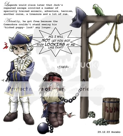
The chibi~ness it cute! The expressions are shot on and I love the text. I also love the style pf it and how it was placed. Well done.
-----------------
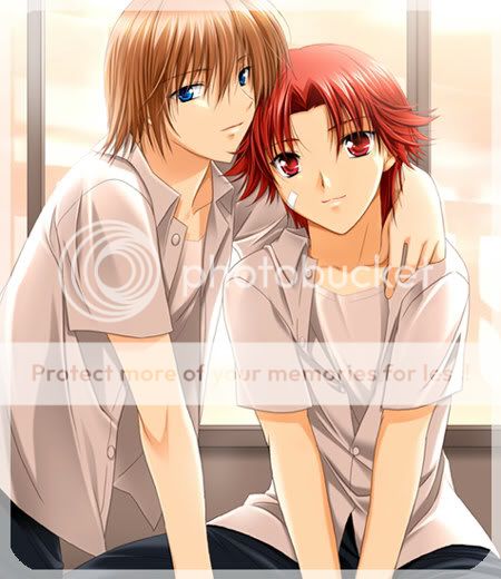
Cheater! I think this is from the Prince of Tennis Dating Game, for the PS2. I am 50% sure. Could be wrong. But is nice, light, pleasant, and smooth.
---------------------
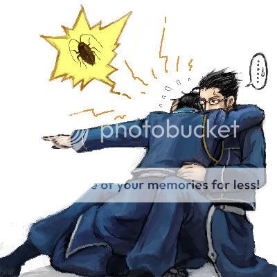
Hahahaha--I laughed so hard when I first saw this. Everyone is afraid of something. Who knew it was a little indestructible bug.
--------------------
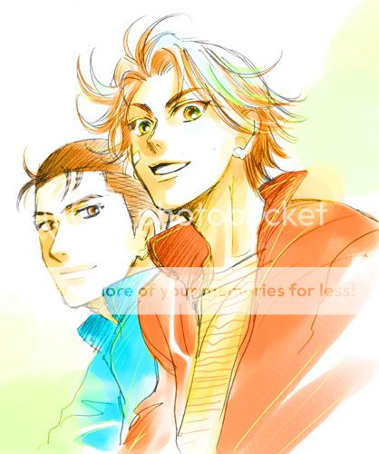
Simply beautiful. This is a good combination of color and style. Rock on.
---------------------
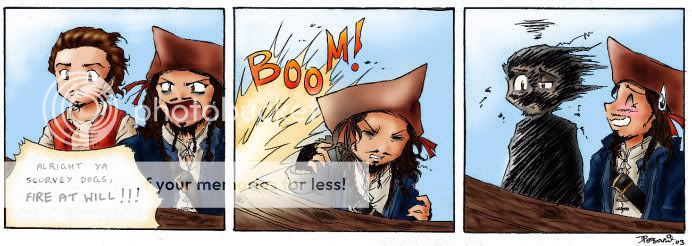
YOU GET WHAT YOU ASK FOR! This is nice. The color and detail or great, as is the style. I don't think this could have been pulled off half as well if it were normal size.
---------------------
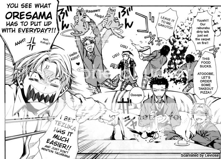
DOUBLE CHEAT! You scanned this! No toast for you!
---------------------
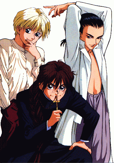
Again, with the official art >.<
This one, though, looks like the start of a dirty joke: A millionaire, Underage undercover operative and a priest in training walk into a bar....
----------------------
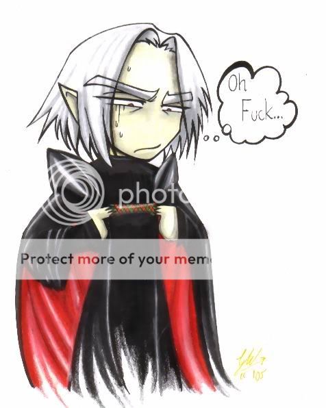
How He-who-must-not-be-named was really beat
-----------------------
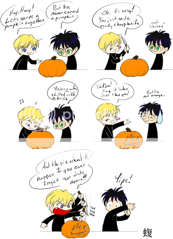
THe following Harry Potter is for a friend who likes this. She found it, lost it, and now I have found it again. I do NOT approve of this pairing, but it will still make you laugh.
------------------

