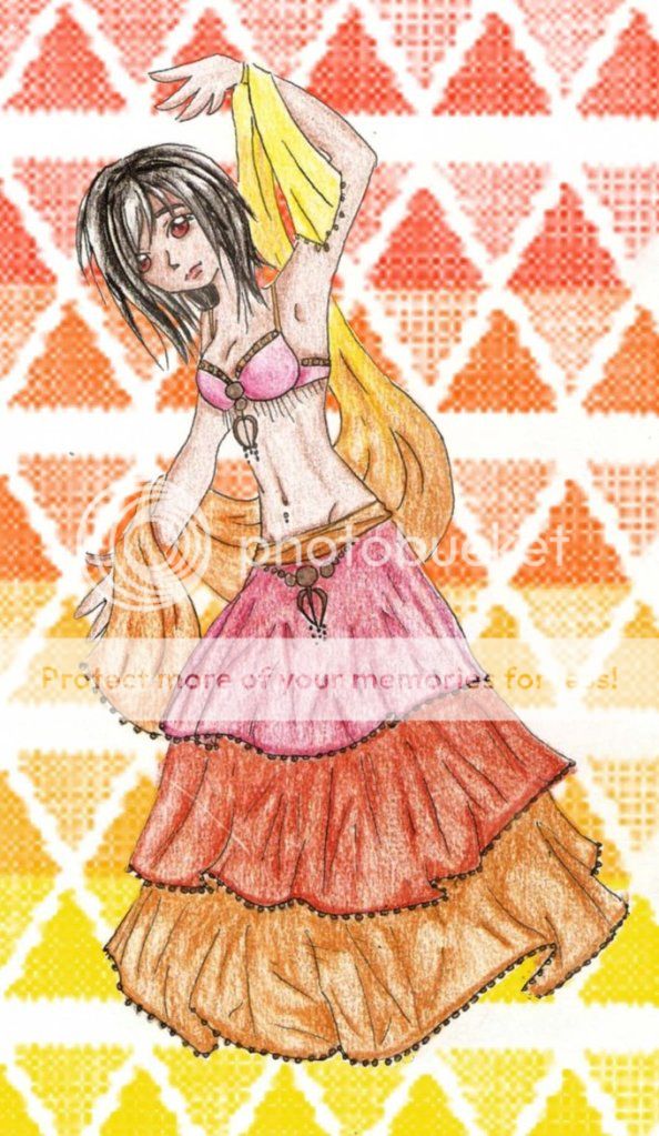
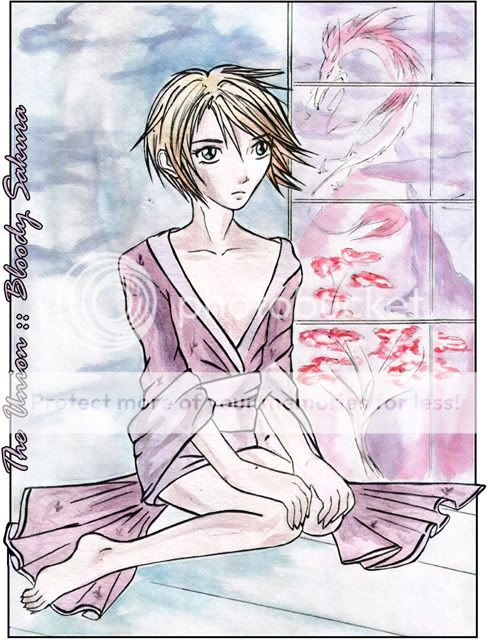
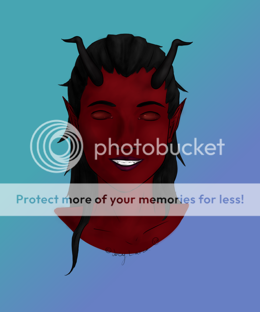
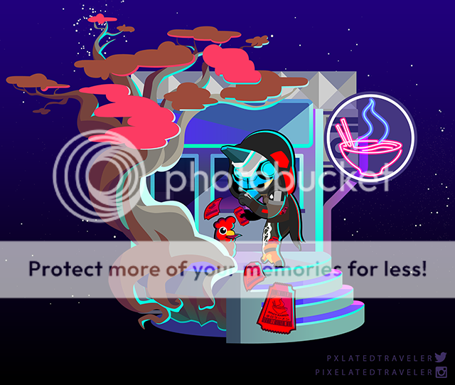
- Title: my avi warrior
- Artist: dedbuni
- Description: its my avi :D
- Date: 03/08/2011
- Tags: warrior
- Report Post
- Reference Image:
-

Comments (5 Comments)
- Kuroi Suishou - 03/08/2011
- The dynamic perspective adds depth and feel where shading is lacking and color is absent. Exquisite detail, however; especially on the mantle. 4/5
- Report As Spam
- Mighty Princess Sakura - 03/08/2011
- If you like to talk about my comment feel free to PM me.
- Report As Spam
- Mighty Princess Sakura - 03/08/2011
-
This is really not bad! I can't believe that I have seen 2 now that I feel like I can give more than a 1 to!! Not bad, really. You even use shading, which a lot of people forget.
Really besides some basic things that can be improved upon (the amount of pressure you put on your paper--makes it look a little hard, not as soft -does not flows as well)
I would say the following:
Smooth out your shading:take a tissue, rub it a little to give a softer look
and
give a little more dimension - Report As Spam
- dedbuni - 03/08/2011
- oh no -----> i forgot the earings :O
- Report As Spam
- zombi3kill3rrei - 03/08/2011
- wow this is great and very detailed. do you have a shop?
- Report As Spam


