- by Sir_Cyrus_of_the_Shadows |
- Painting And Drawing
- | Submitted on 06/17/2010 |
- Skip
- Title: I Need You
- Artist: Sir_Cyrus_of_the_Shadows
- Description:
- Date: 06/17/2010
- Tags: need
- Report Post
Comments (4 Comments)
- Sir_Cyrus_of_the_Shadows - 07/01/2010
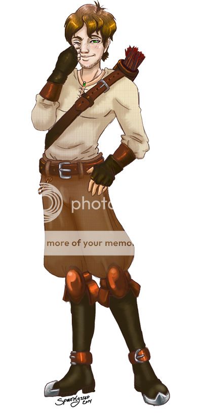
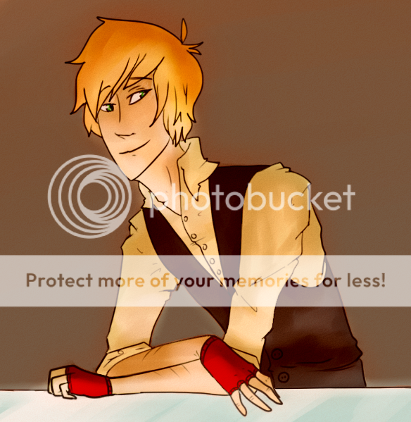
- I don't draw with exact and realistic proportioning. It's stylized. Usually, illustrations aren't perfectly proportioned. The art of illustrating allows people to draw in what ever way they fancy. Because of that, anatomy proportioning varies greatly among the individual illustrator.
- Report As Spam
- Ultra Adeline - 06/20/2010
- Anatomy isn't very good. The torso is much too long for the legs. The expression is odd, and the line above the stomach muscles is way too pronounced; it makes him look anorexic. All the weird creases coming out of his pants makes it look like he's got too much skin and its saggy. What's with the line down the middle of his foot? 2/5
- Report As Spam
- sohi_moon - 06/17/2010
- oh my god he looks hot...<_< >_>...i dont say that about a lot of guys so you didnt hear that from me. his expression is slightly sarcastic though. and the person below is right, the anatomy is a little messed up.focus more on the legs next time.
- Report As Spam
- Princess Khalida - 06/17/2010
- it's out of proportion but other than that it's pretty good...
- Report As Spam


