- by kingspartan12345 |
- Painting And Drawing
- | Submitted on 01/28/2010 |
- Skip
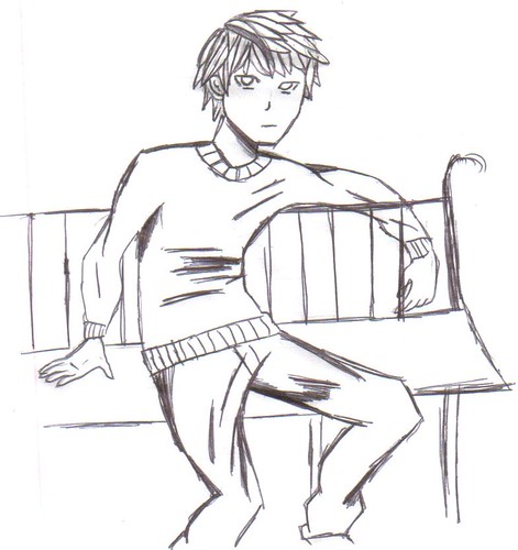
- Title: Jake
- Artist: kingspartan12345
-
Description:
I just drew it
tell me what i can improve on please - Date: 01/28/2010
- Tags: jake
- Report Post
Comments (3 Comments)
- hadulaa - 01/31/2010
- its pretty good but the legs look sort of awkward?
- Report As Spam
- katacombs - 01/31/2010
- Yeah the elbow behind the bench really looks a little wierd.. More like it's flexable, but everything else is good. 4/5
- Report As Spam
- XX_XXQuitXX_XXX - 01/28/2010
- not to be a critique but...the elbow behind the bench looks a little wierd and i suggest fixing his right eye but uder then that its good
- Report As Spam


