- by blaster219 |
- Painting And Drawing
- | Submitted on 05/28/2009 |
- Skip
Comments (7 Comments)
- blaster219 - 05/29/2009
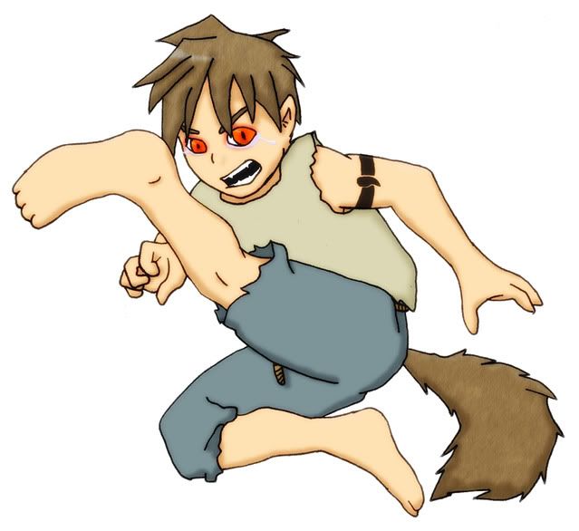
- Yeah, it's meant to be sole towards the "viewer"
- Report As Spam
- Fate The Hedgehog - 05/29/2009
-
There are calluses on that region of your foot, as well as on the heel.). A good spot to add a little shading (doesn't need to be intense, just lightly) would be where the side of the foot meets the bottom.
Hope that helps you. wink
(Haha, I had to break this into two comments :s) - Report As Spam
- Fate The Hedgehog - 05/29/2009
- I think I can see how the foot is intended to look (that's supposed to be the bottom of his foot right?). Either way, there is no way you could see the top of his foot from the angle at which he is drawn, so my advice to you is to add some more lines, and perhaps some shading to give it the look of the bottom of his foot. I -really- good place to start would be where the toes 'meet' the foot (look on your own foot; it’s not flat by any means.
- Report As Spam
- Sukomo - 05/29/2009
-
yeah, the foot is pretty much dislocated. Even if it was twisted, it's not possible to twist it that way
Don't use textures in hair, actually colour it
and work on your shading, there basically is none. - Report As Spam
- blaster219 - 05/28/2009
- No, its not meant to look twisted. I spent ages trying to get it right but gave up in the end. But it is supposed to have only 4 toes on it though.
- Report As Spam
- ThisPersonDoesntExist - 05/28/2009
- i like it and the foot is a little bit weird 4/5 though
- Report As Spam
- yoxyoxyo - 05/28/2009
- is his foot supposed to be disturbingly twisted like that? xD
- Report As Spam


