- by riddel kid |
- Painting And Drawing
- | Submitted on 12/30/2008 |
- Skip
Comments (7 Comments)
- Obsessive Delusions - 06/03/2011
- its better then i can do ^-^ good job
- Report As Spam
- SyllyPickle - 12/12/2009
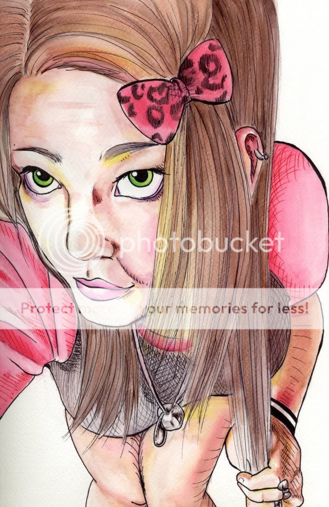
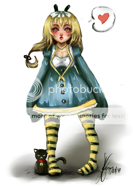
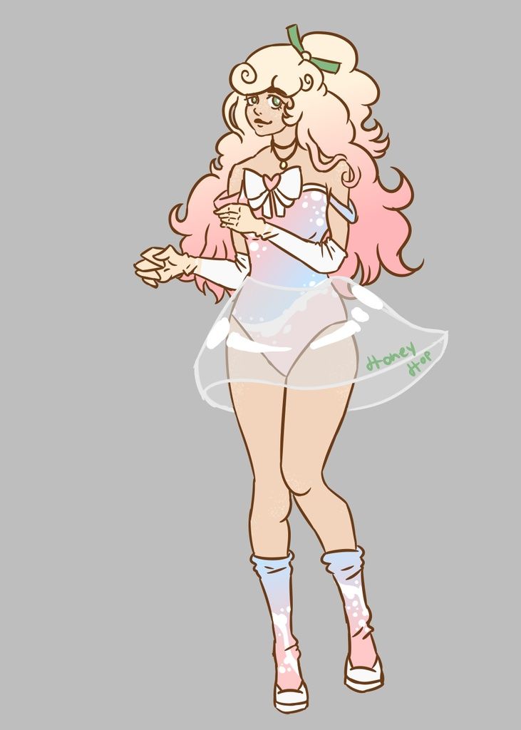
- The chin is kinda weird...And I think she's a little to thin.
- Report As Spam
- x kimchi x - 07/04/2009
- i agree with Lunar Dive on the chin. the chin makes the shape of the face look like a flower petal.
- Report As Spam
- Kriemhild Gretchen - 02/09/2009
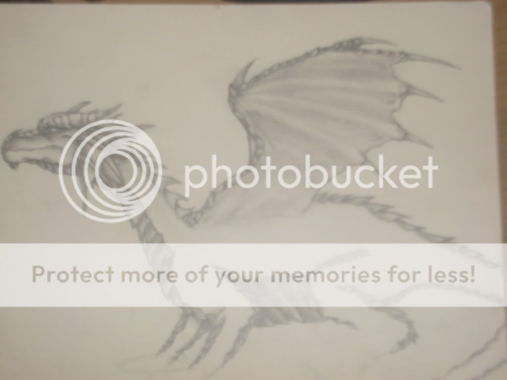
- This isn't negativity, it's criticizing. The whole thing is out of proportion. She's too thin, the chin looks like a spike, and wings are wrong.
- Report As Spam
- GianellaBaby - 01/01/2009
- Quit pointing out the flaws and say something good. Dont be so negative! I think it looks pretty good. 3/5
- Report As Spam
- greflon - 01/01/2009
-
hey, lighten up guys, I think she's put some effort into this.
nice job Ridell, certainly better than anything I could do. - Report As Spam
- SolsticeXII - 12/31/2008
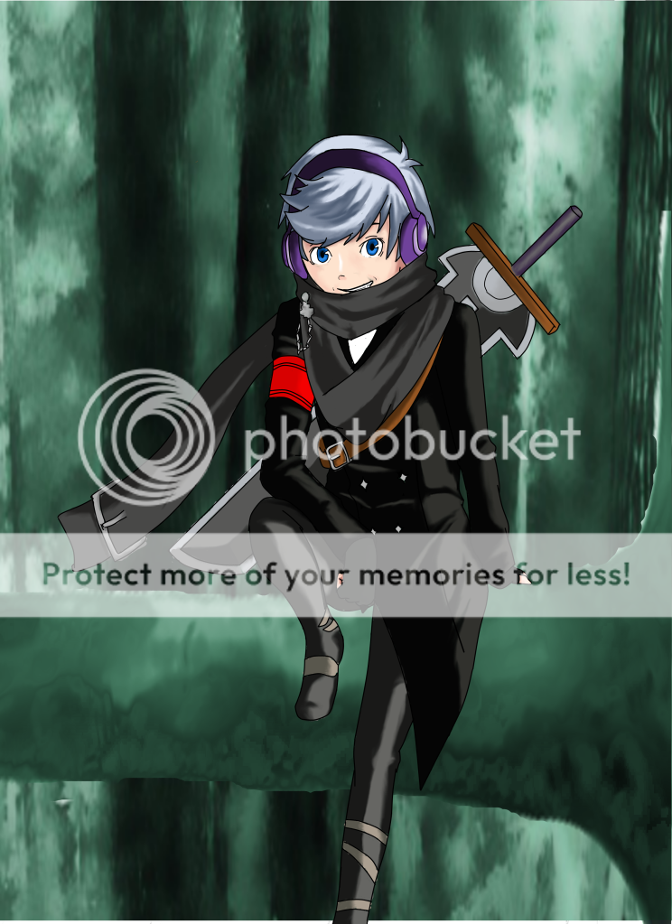
- the girl looks weird.... she looks way too thing and her chin is too pointy. Plus, the chains on her pants look like they were drawn on and not actually on her pants. (They don't wrap around her leg) but you draw chains very nicely
- Report As Spam


