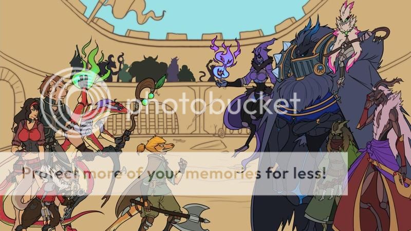
- Title: Sakura-con Mascot Entry
- Artist: nya`
-
Description:
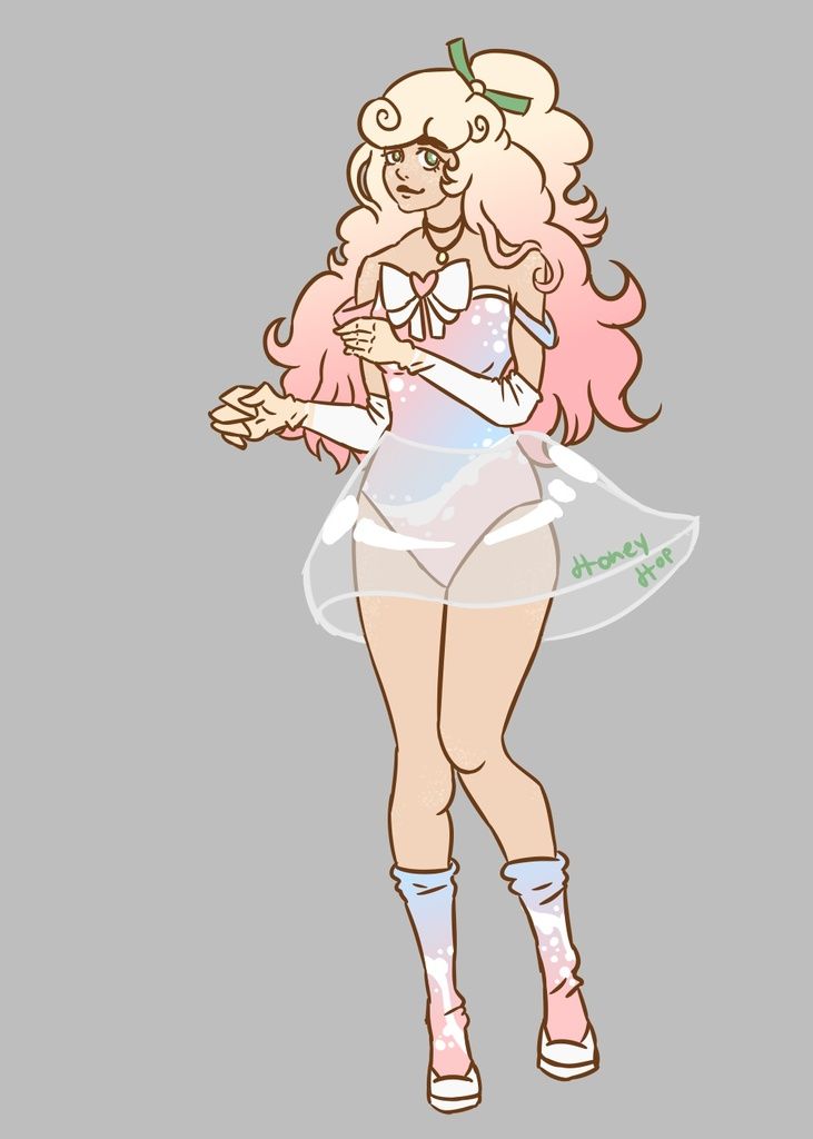
As the title states, this was indeed my entry for the 2008 sakura-con mascot contest. C: Didn't win, but hey, there's always next year. XD (edit: Fwooo I forgot to mention that I was beat good, though. winner was x10 awesome. <33)
Man I hate having to make images 640 pixels. :B
A bigger image is on my dA. <3 - Date: 07/15/2008
- Tags:
- Report Post
Comments (7 Comments)
- spastic jaki - 06/21/2009
-
very pretty.
and beautiful colors!
5/5 - Report As Spam
- Elysapeth - 05/25/2009
- The soft colors and the little details are great, such as the folds of the cloth. I can also see where people are coming from about the bent leg being disproportioned, but I have always found that to be the hardest part. Over all It's a great composition. I likethe way she is positioned. It helps your eyes move through the work and notice all the little details.
- Report As Spam
- OldBlueGenes - 05/25/2009
-
Kawaii!!!
I agree with those below me that something is off with the bent leg. But I don't know enough to tell you more than that! sweatdrop - Report As Spam
- xXLightSerenityXx - 01/10/2009
- The end of the leg and the bottom of the foot looks seem to far from each other from the shadows and the wrinkles show.
- Report As Spam
- Box Jellyfishy - 01/10/2009
- nice :]
- Report As Spam
- kitkatqueenie - 11/17/2008
- I understand the right leg is bent, but it still looks a little funky. Like, unproportional.
- Report As Spam
- Bannana Muffins - 10/04/2008
- wow its so cute well done 10/10
- Report As Spam


