- Title: First Page
- Artist: Sugarkey
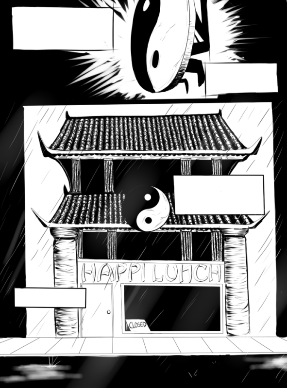
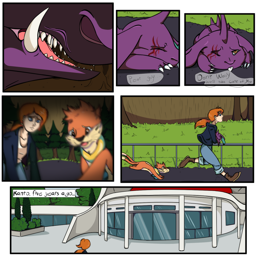
- Description: I'm making a webcomic, and this is the first page! I'm p. bad at architecture.
- Date: 09/08/2012
- Tags: first page comic webcomic
- Report Post
Comments (4 Comments)
- Wrexie - 09/17/2012
- Your lines are a bit tilted and the columns on the sides of the building are looking a bit flat, but the composition works well and it's easy to "read" the picture and tell what's going on, which is very important. uwu
- Report As Spam
- BobCatHKSS - 09/09/2012
- 5/5 you should draw for the HKSS manga.
- Report As Spam
- Sugarkey - 09/08/2012
- yeah there will be! I just left it out before doing the rest of the pages
- Report As Spam
- Catalytic Productions - 09/08/2012
- Are you kidding?? This looks amazing! But what are the blank boxes for? Should there be text in them?
- Report As Spam


