- by RPGgrenade |
- Comics
- | Submitted on 10/11/2008 |
- Skip
- Title: Clash
- Artist: RPGgrenade
-
Description:
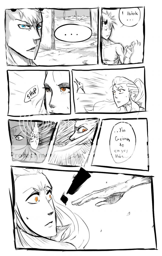
Well, this is part of a future fight scene in my comic, at http://got-comic.uni.cc/
That's James on the right and the other is a character not yet revealed entirely, I know the Arms are little weird, but that's how it turned out - Date: 10/11/2008
- Tags: clash guardian twilight james jaitem
- Report Post
Comments (7 Comments)
- Ty Gwynnia - 01/07/2012
-
*looked at everyone else's comments from 4 years ago*
Well, -I- think it looks pretty good. Not the best, but definitely not the worst or ugly. I'm sure you're drawing has gotten better by now. =3 - Report As Spam
- AxolotlUmbrella - 10/19/2010
- fail
- Report As Spam
- BritAurora - 10/15/2010
- Well, It could use some work. I find the coloring/paint job quite interesting but try to neaten it out a bit. Work on movment, Not everyone has to be faceing your point of veiw. Have them faceing each-other and have them be stareing at each-other. The heads and faces need allot of help (no offense. And last but not least, work on anatomy. Anatomy can be difficult but once you have it down it can work wonders. Don't worry though I hav'nt gotten my annatomy down either.
- Report As Spam
- luckystaranime - 09/19/2010
- that really isnt good...at all
- Report As Spam
- fiddle foddle - 03/06/2010
- I agree with Larten.
- Report As Spam
- Cajes the Freak - 09/29/2009
- wow... that is... one word: Ugly... as heck..
- Report As Spam
- Skittles1238 - 07/27/2009
- really good even if the arms are odd i like the concept
- Report As Spam


