- by Nameless Ulrica |
- Comics
- | Submitted on 12/24/2008 |
- Skip
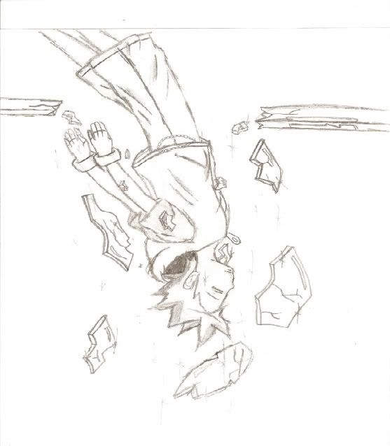
- Title: Sora
- Artist: Nameless Ulrica
- Description: um i tried my best to make a drawing of sora but idk. lol
- Date: 12/24/2008
- Tags: sora
- Report Post
Comments (7 Comments)
- Quiris - 07/30/2009
-
Pants do need to be poofy-- a keyblade would look nice, too but it's not necessary-- his arms are a bit short, and (opinion) I think that the eye should arch upwards more like: u.u instead of n.n
It would make him look more knocked out :3 - Report As Spam
- AFallenNightmare - 07/28/2009
- i just see to faults with this, he needs a keyblade and he has to have poofier pants. if i see any more i'll comment again, otherwise, its good.
- Report As Spam
- Xesene - 07/27/2009
- Great Job!
- Report As Spam
- Cheshire Blackthorn - 07/25/2009
-
i like it its sooooo coollllllzzzz
- Report As Spam
- Panromantic - 07/24/2009
- awsome
- Report As Spam
- Code-Sama - 07/14/2009
-
The pose is perfect! But the pants need to be a little poofier, and his hair is a bit longer, other wise great job! ^^
4/5 rate back? - Report As Spam
- xXbabylove15 - 07/05/2009
- where's his keyblade.. <=[
- Report As Spam


