- by Suprcheese |
- Comics
- | Submitted on 05/01/2009 |
- Skip
- Title: To all critics
- Artist: Suprcheese
-
Description:
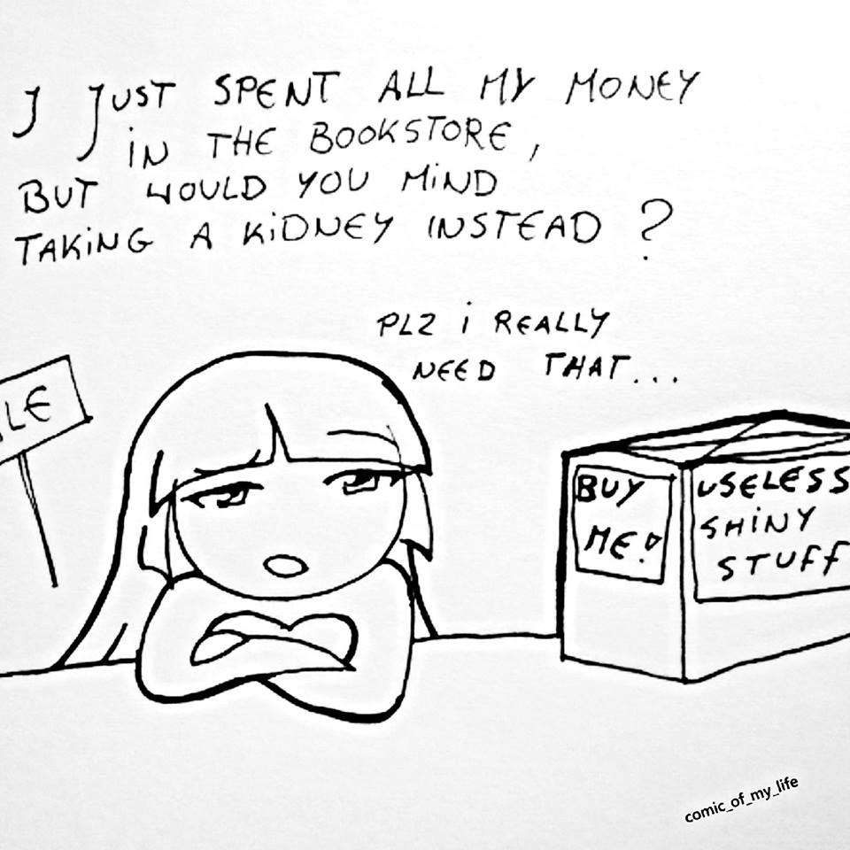
D; onn some of my artwork peaople said not good but funny alot o.o;
I want to know what you mean by, NOT GOOD!
D:<
to all peaople who have encouraged me and complimented, you can live ^-^
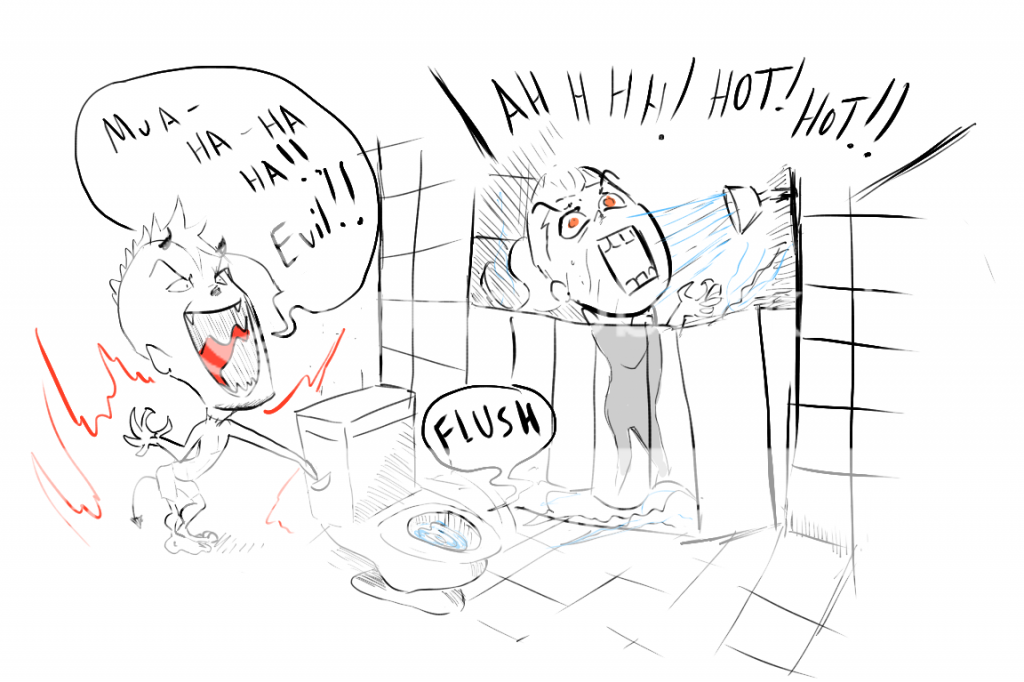
BTW that was a random gangster pickle xD - Date: 05/01/2009
- Tags: critics
- Report Post
Comments (7 Comments)
- xombiejosh - 05/13/2009
- ...i finnally found the gangster pickle!*cuts him up and puts the peices in a jar*
- Report As Spam
- NoRingingChimes - 05/13/2009
- The pickle looks like Mr. Peanut. XD
- Report As Spam
- XI_moonchild_IX - 05/04/2009
- Also, try establishing certain areas for your word bubbles/ work on making them more uniform in style. That way they don't look so cramped. Giving the whole piece a border might also help make it look a little more advanced..it also keeps words from disappearing off the edge.
- Report As Spam
- XI_moonchild_IX - 05/04/2009
- Could work a lot more on creating panels/ putting more effort into your stuff. It is funny, but the wobbly lines and slips tend to detract. It looks like you work in pen...so consider doing a light sketch with pencil first before going over it with pen. Then, if you can edit your stuff on the computer just a little, you could try increasing the contrast so that everything looks brighter.
- Report As Spam
- Kitsuke Aura - 05/01/2009
-
Maybe this could give you a trick... http://j8d.deviantart.com/art/How-I-draw-chibi-girl-XD-41595374
Start with chibi character first and then you can go more far than that - Report As Spam
- ll Epic Stalker ll - 05/01/2009
-
hmm.....-grabs pickle and eats it- SOUR! -spits out- O.O xP
but.....y'kno......if u wanna be REALLY good, try 2 erase some of the un-neaded lines....okia? x3 - Report As Spam
- President Cheddar - 05/01/2009
- ok inprove on body form. otherwise youra really good artist.
- Report As Spam


