- by Yume_Silvermoon |
- Comics
- | Submitted on 11/27/2008 |
- Skip
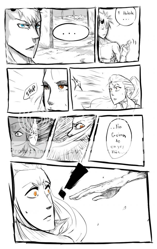
- Title: Spirit Guardian Kinami: Page 2
- Artist: Yume_Silvermoon
-
Description:
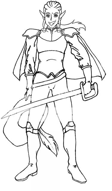
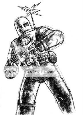
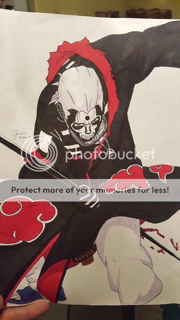
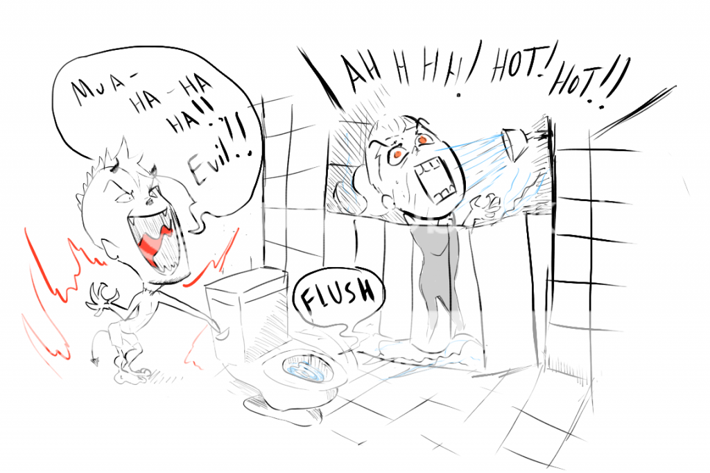
Page 2 of my comic. Kinami's not very nice, is she?
Oh, and I forgot to mention, it's supposed to be read right to left, Japanese style. (Please forgive my weeaboish tendencies.) - Date: 11/27/2008
- Tags: spirit guardian kinami
- Report Post
Comments (7 Comments)
- ii mobkilla ii -murdah - 12/03/2008
- neat-o.
- Report As Spam
- Mattation4ever - 11/29/2008
- this is amazing. keep the good work up. i love it.great!
- Report As Spam
- HanoMayonaka - 11/28/2008
-
(adding more because you cant have more than 500 letters in one comment)
Note that the speaker's mouth in panel 5 is also too wide, almost like he's yawning. If you were going for a calm, collected person, you should make the mouth smaller. I do howver, like the shape of the person's mouth, it matches the tone of the words...
Don't think you have t go back and fix all this stuff, because you dont. These are just tips for future pages you may want to work on.
- Report As Spam
- HanoMayonaka - 11/28/2008
-
i like the costume design in panel 2, but the legs look somewhat stocky in the first panel.
To make the fourth panel more dynamic, you should have made the girl more in the boy's face, to let her agression be very evident.
I don't like the last panel however, it should have been positioned on the right side, to keep the reader's eyes traveling from the top left of the page to the bottom right (which is natural for a reader to do, or people who read left to right at least) - Report As Spam
- angel_alex_94 - 11/28/2008
-
again neat.
and again. "Stupid motor skills!"
- Report As Spam
- XxYingMingxX - 11/28/2008
- You must Ink it I like the patterns on Kinami's skirt you should start a comic buisness and sell the comics for $$$
- Report As Spam
- Trouble Gail 3 - 11/28/2008
- weird...but i like it
- Report As Spam


