- by micaiah_san |
- Comics
- | Submitted on 11/11/2008 |
- Skip
- Title: study room from hell
- Artist: micaiah_san
-
Description:
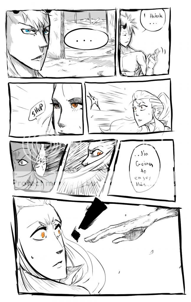
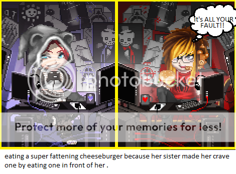
well this pic i did not detail thats y it a little lacking when it comes to the greatness of the drawing i started it then time passed and yet no detailing and more time passed......no detailing. well enjoy.
Everyone i made a new version of this drawing! i have yet to upload it so until then see ya ^^ - Date: 11/11/2008
- Tags: study room from hell anime
- Report Post
Comments (7 Comments)
- Nobahdee - 12/22/2008
- because some of the greatest comics/manga aren't colored and I sometimes prefer them without color for the sake of imagintion. Back on the written words, I would suggest actually typing most of them, at least. Again, I do like the idea because I can relate to it. That's about it and I hope you get better grades after all that studying. Hehe.
- Report As Spam
- Nobahdee - 12/22/2008
- Some of the words are too hard to see. I really dislike when the text is too small. I won't complain so much about the lines not being so neat based on what you said in your description, but it still irks me. It's an interesting little story and it's kinda cute. The fact it's not colored doesn't bother me (to be continued....)
- Report As Spam
- Homicidal Muffinz - 12/19/2008
- umm....
- Report As Spam
- F i sh-Seychelles - 12/19/2008
- ...it's nice...but please use weeaboo language properly. :[
- Report As Spam
- MessyLucia - 12/19/2008
- Well its not bad, i kinda like it, but ive seen better. I guess u row when u have nothing to do right?
- Report As Spam
- tokio hotel 08 - 11/29/2008
- thats my teahcer right there(we have to write on one side of the paper if not i fail)
- Report As Spam
- Y u n q S t a r J o n - 11/29/2008
-
ahh!!!!!!!!!!!!!!tomuch words
- Report As Spam


