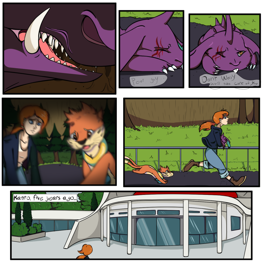
- by your_evil_doppleganger |
- Comics
- | Submitted on 11/06/2009 |
- Skip
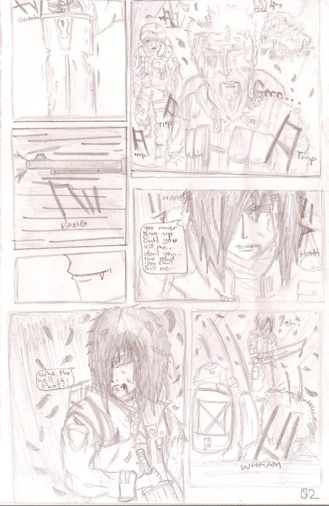
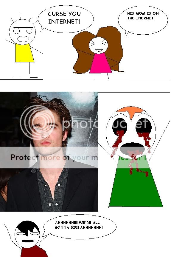
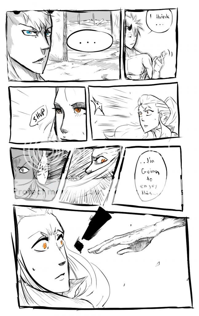
- Title: Project-Blood Chapter 1 pg 2
- Artist: your_evil_doppleganger
- Description: project-blood page 2
- Date: 11/06/2009
- Tags: projectblood chapter
- Report Post
Comments (7 Comments)
- Vuzastic - 03/12/2010
- nice picture
- Report As Spam
- Captain Critique - 12/28/2009
- Everyone has trouble making their work veiwable on the computer, but it's true that bigger speech bubbles help. I'm still working on this x3 I hate what gaia does our comics, when they look so perfect in real life yet like crap on the computer. I'll be watching this to see how it develops and if you go through with it, so don't quit O-O
- Report As Spam
- yui53 - 12/03/2009
- omg cool
- Report As Spam
- DREAD CRUZ - 12/01/2009
- you need to find a way to makke your drawing on this computer more viewable. But it looks like you have sum good sketches going on
- Report As Spam
- emanekafj - 11/08/2009
- he's right about the proportions but I cant draw porportions either so ur still WAY better then me! luv the smile in the third panel! Also, bigger speech bubbles would be nice cuz I have to copy and paste to read (I'm not stealing ur work everyone who knows me knows that I can't draw like this) but PLZ CONTINUE! I LUV A SERIES!
- Report As Spam
- your_evil_doppleganger - 11/07/2009
- thanks for letting me know. biggrin and im having a hard time drawing the hands XD
- Report As Spam
- Captain Critique - 11/07/2009
- well, you know what you're doing when it comes to heads, faces, and clothing, but your preportions and hands could use a LOT of work. It just kind of ruins the whole page. It's also very hard to read, but gaia's stupid formats are usually to blame for that x3
- Report As Spam


